The Rise Of Minimalistic Web Design
Since the 1950s, minimalism has been a popular design choice, making its way into virtually every visual medium in existence, and even music.
The reduction of screen space in mobile devices is making minimalism not simply an aesthetic choice, but a necessity.
This reality is forcing designers to familiarize themselves with the basic tenets of minimal designs, and how to maximize the visual impact of them with such limited real estate. Many popular web sites have recently switched to simplified, minimalistic designs.
How Minimalism Can Help Web Design
A successful minimalistic design is uncluttered, eye-catching and simple to process by the observer. Whether you’re interested in promoting virtual events or just displaying static information, a minimalist design is a good way of simplifying information.
In the majority of instances, a major component, like an embedded video, pictures or other forms, is surrounded by a small set of features.
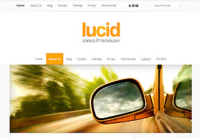
A minimalistic web design from Elegantthemes.com.
Minimalism is not solely about eliminating extraneous elements; true minimalism is highly effective because the design started with the least amount of elements in mind in the first place. With this, the designer takes into consideration the end user experience and works to make not just an uncluttered interface with some missing features, but one which is a pleasure to use and has all the features a visitor expects.
Color
One of the hallmarks of minimalism is a limited palette. By limiting color choices, the designer can achieve a greater contrast and emphasis on important parts of the interface.
This does not mean minimalistic designs are drab. Web pages for youth obviously will benefit from a splash of a bright color or two.

Minimallistic Theme Example From ithemes.com.
A classical, black and white design can remain modern and crisp while adding a single accent color to the header, menu items or other important features on the page. Color alone can transform a and inject life into a design.
Whitespace
Negative space, or whitespace, is often used creatively in minimalism through tweaks in text and object alignment, margins, padding and more. Empty space can emphasize the other areas by leading the eye to them naturally.
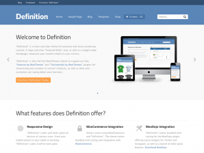
Design example from Woothemes.com.
As an example, the designer should look to grid-based designs, which marry uncomplicated image and text blocks in even ratios to produce a clean look which just work, even though they are very simple.
Type
Good fonts are very important in minimalism, as there is usually very little text in type of design.
Whatever text is there, in the menus, subheadings, logos, etc., should be clean and bold, lest the stronger design elements simply overpower and the message is not delivered. Fonts should be cohesive with erest of the design, and nothing is worse than seeing a font mismatched with the rest of the graphical elements (think a kiddie font on a serious business website, or an Old English font on a bright gaming site. Ouch!)
Common Mistakes
The irony of minimalism is that while it is simple to look at, it is difficult to master. The difference between cutting-edge, contemporary work and something dull or frustrating can come from just a few things. Here are a few things to watch out for:
- Poor Navigation. Minimalism should make websites things easier to use. When in doubt, use very simple and clean text menus or breadcrumbs. Nothing is more frustrating to visit a site and be confronted with a piece of modern art with zero discernible way to get around, except perhaps by clicking odd areas on the page and hope a menu pops up.
- Unbalanced Elements. Misaligned elements, conflicting color choices, text which is too small, lack of negative space - these types of flaws can ruin an otherwise promising page, especially when a page designed for a regular browser is viewed on a mobile device. As you can get spoiled when working in a bigger area, it might pay off to regularly load the page on a mobile device as you work in order to see the effects on your design.
- Poor Focus. The point of minimalism is to draw attention to the content through the use of bold, yet spare elements. Generally, it is difficult to try to use minimalism to direct the attention to many choices, as is possible with traditional web design full of menu items, text links, widgets, etc. Designers should work backwards from the end point they wish the visitor to arrive to, and ensure each prior step correctly focuses the attention on how to get there.
Minimalism done right is pleasing to the eye and can be much more engaging than a typical web design. It does require a bit of study, as all of the basics of art come into play with great importance: the color wheel, composition, space, shape, form, texture and more.
The work spent on learning these things will, however, pay off with better looking designs in the much tighter mobile spaces.
Stephan Jukic is a freelance writer who generally covers a variety of subjects relating to the latest changes in white hat SEO, mobile technology, marketing tech and digital security. He also loves to read and write about location-free business, portable business management and finance. When not busy writing or consulting on technology and digital security, he spends his days enjoying life’s adventures either in Canada or Mexico, where he spends part of the year. Connect with Stephan on LinkedIn.