Top 5 Web Design Trends To Watch Out For 2014
A more simplified Yahoo! Logo, websites with Helvetica and hipster-inspired themes – these were the top web design trends for the past year.
Now that 2014 is on a roll, what are the hottest web design trends to watch out for?
That is exactly what we will find more about here.
Top 5 Web Design Trends for 2014
When you browse through tech blogs and other websites, you will see traces of the influence of the 2013 trends for web design.
Let’s take the case of the updated Yahoo! Logo as an example. Most people expected the logo to be more complex than its predecessor, but it actually was not. When you look through the logo blueprint, the major elements were Sans Serif, a variable baseline, a tilted exclamation point, variable size letters and all uppercase. For a logo that hasn’t been updated for 18 years, the change is a welcome one and it turned out to be a success.
Will the same simplification of logos and designs be an emerging trend for 2014? Let’s see.
Here are the top five web design trends to watch out for this year.
Simplicity
Whether you’re updating your logo like Yahoo! or if you are giving your website an overhaul in terms of looks, simplicity is a trend that you’d definitely want to follow.
This is especially true if you would like to optimize your site for the search engines. The more complex your site’s design is, the more confusing its layout would be. This does not bode well for the online users who like to easily navigate through your site. One of the trends in simplicity is to use menus with one or two levels max. Gone are the times of 3 or 4 levels deep drop down menus.
So keep your design as basic and as simple as possible.
Flat Design
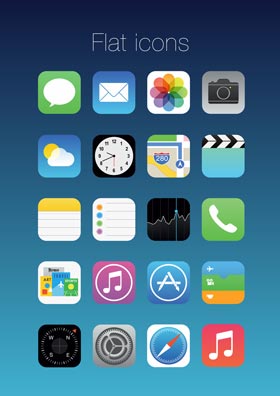 The opposite of a flat design is a 3D or Skeumorphic design which emerged as a trend in the years up to 2013.
During the latter part of last year, flat design slowly became popular and its use is bound to continue for this year.
Bigwig companies like Apple and Taco Bell have recently ditched their Skeumorphic design in favor of flat.
Most prominent example is probably the look of Apple’s operating system iOS 7.
This allows users of both mobile and desktop computers to have a more accessible browsing experience.
Improved Scrolling
Parallax scrolling was a huge trend not just for 2013 but for the past few years. Unfortunately some sites were overdoing it and added the effect for the effect’s sake.
For 2014, this design trend would continue but in a more restrained, improved way for a better user experience.
Shorter Video Storytelling
Instead of creating a 3 or 5-minute video to deliver your marketing message, the trend is to cut videos to as short as 5 to 7 seconds. Online users are getting more and more impatient and if you want your videos to get clicked, keep them short.
While Youtube remains the world’s largest video site, the 2 immensely popular video sharing services Vine and Instagram restrict videos to a length of 6 seconds / 15 seconds.
Real Models over Excessive Retouching
Finally, all the brouhaha about excessive use of Photoshop and other photo retouching tools might come to an end with the use of real models. At least, this is applicable for brands who would like to reach out to a broader audience spectrum.
Having un-retouched photos of real people make brands more relatable, so this is a trend that might just emerge for 2014.

Out of all these web design trends, which ones are you most looking forward to seeing on your favorite website?